The Label

The story behind the label
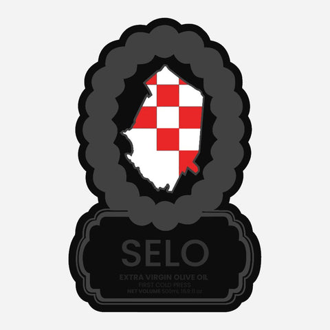
Every part of the Selo label was designed to reflect where this oil comes from and what the brand stands for.
With the arrival of the new harvest, we thought it was a good time to share the thinking behind the design. The label brings together Croatian visual motifs, regional references, and small details tied directly to the product itself.
Rather than using generic Mediterranean imagery, we wanted the bottle to feel rooted in a real place: Croatia, the Adriatic coast, and the village sensibility that inspired the name Selo.
Designed in collaboration from the beginning
The Selo label was developed in collaboration with Parker Langlois, a Canadian industrial designer who has worked with the brand since its early days.
As Selo has grown, the label has been refined over time, but the core idea has stayed the same: create something distinctive, clean, and unmistakably Croatian.
What follows is a closer look at the main visual themes built into the bottle.

The Croatian interlace
The three-strand interlace, or troplet, was an essential part of the label from the start. It is one of the most recognizable motifs in Croatian visual culture, with roots reaching back to the early medieval period.
Variations of this interlace appear in old churches, stone carvings, and ornamental decoration throughout Croatia. On the label, it helps anchor the design in a distinctly Croatian tradition.

Biograd na Moru
At the center of the label is an outline referencing the Biograd na Moru region, the coastal area tied to Selo’s origins.
Biograd holds a meaningful place in Croatian history and helps ground the bottle in a real landscape rather than an abstract brand story. For us, place matters.

The red and white chequy
One of the most recognizable Croatian symbols is the red and white chequy associated with the national coat of arms. Its exact historical development is debated, but it has long been part of Croatia’s visual identity.
Including it on the label was a natural choice. It immediately signals Croatian heritage while adding structure and rhythm to the composition.
The olive branch
The olive branch is a familiar symbol, but here it serves a very direct purpose. It points to what is actually inside the bottle.
On a label full of cultural references, this detail brings the design back to the product itself: real extra virgin olive oil made from olives grown on the Adriatic coast.

What “Selo” means
Selo translates roughly to village. We chose the name because it captures something important to us: land, work, family, food, and the kind of communal life that still shapes the Croatian countryside.
The name is simple, but it carries the spirit of the brand. We wanted it to feel honest, grounded, and tied to real agrarian life rather than luxury for its own sake.

A subtle olive in the logo
One of the original branding details we still love is the hidden olive worked into the second “O” of the SELO OLIVE mark.
It is a small touch, but it reflects the broader approach behind the label: thoughtful details that reward a closer look without making the design feel busy.

A label tied to place
As Selo continues to grow, the goal remains the same: offer an olive oil that feels genuine, traceable, and rooted in Croatian land and culture.
The bottle is only one part of that story, but it matters. We wanted the label to carry the same values as the oil inside it: character, care, and a clear sense of origin.
If you’ve ever wondered why the bottle looks the way it does, now you know.
Family-rooted, Croatian, and made for the table.
Živili!
The Erlić Family